

BACKGROUND
This was commercial work for a residential building and the brief included interior design, Facade design, and of course rendering. Working with constraints like a ready and unchangeable architectural plan is quite interesting, you’ll have to think outside the box but your ideas must still fit the box (I never quite liked this). As an artist I want to work boundlessly with ultimate freedom, however, I soon realized that design itself exists only because of constraints, problems, and challenges. Without these constraints, design is a pretty boring, if not impossible affair.
These constraints are still there in the rendering phase but the freedom to light and compose scenes feels like ultimate power most of the time. As 3d artists, We can enhance the architecture and uncover new and previously unintended experiences with every question we ask.
This project was made with Revit, 3dsmax, Corona Renderer, and Adobe Photoshop.
1. MODELLING
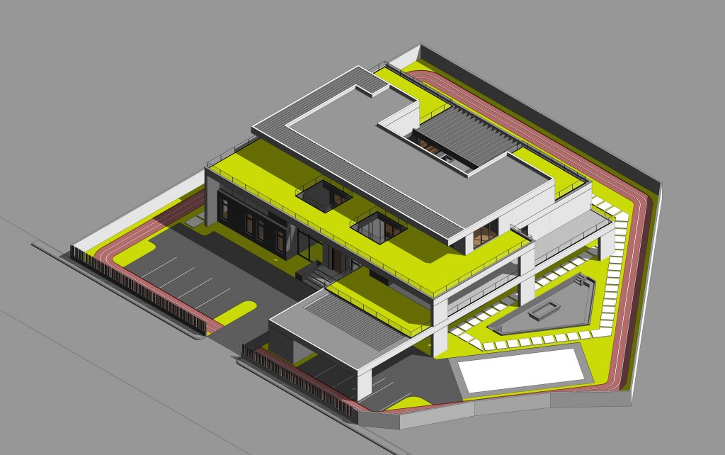
Because of the project’s nature, basic 3d modeling was done in Revit. This allowed multiple iterations during the Facade design stage. One thing to note is that you’d need to custom-make a lot of elements instead of relying on Revit’s native library. This switch allows you to create with the level of detail and precision required in high fidelity Visualization. So things like your windows and window frames, curtain walls, beams, and columns are better off made as custom generic models. They end up being lighter and easier to manipulate in 3ds max. The process takes a bit longer, but it’s definitely worth the trouble.
2. CAMERA AND COMPOSITION
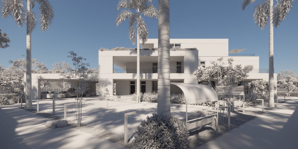
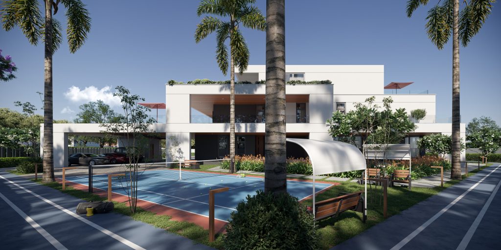
In commercial works of this kind, the expectation is that each view rendered contains significantly large parts of the building. So wide angle lenses between 16 to 24mm were mostly used.
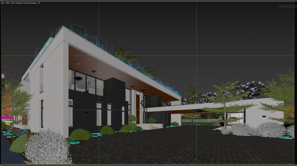
For this shot above, I’ve gone as low as 13mm to capture the entirety of the building, exaggerating those peaks and giving me a dramatic and strong silhouette. This sort of lens can overly stretch parts of your image. The trick is to avoid using any elements close to the foreground. A Car in the right bottom part of the image would be very uncomfortable to look at.
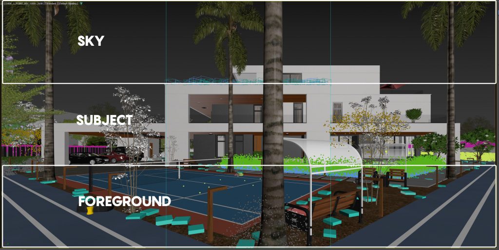
I also employed the rule of thirds here to section my image into parts. in this image, for instance, I’ve used the rule of thirds to zone foreground, subject, and background so they share a fairly even amount of space in the frame. Centering your subject isn’t something you usually do when using the rule of thirds, but it worked a charm in this case.
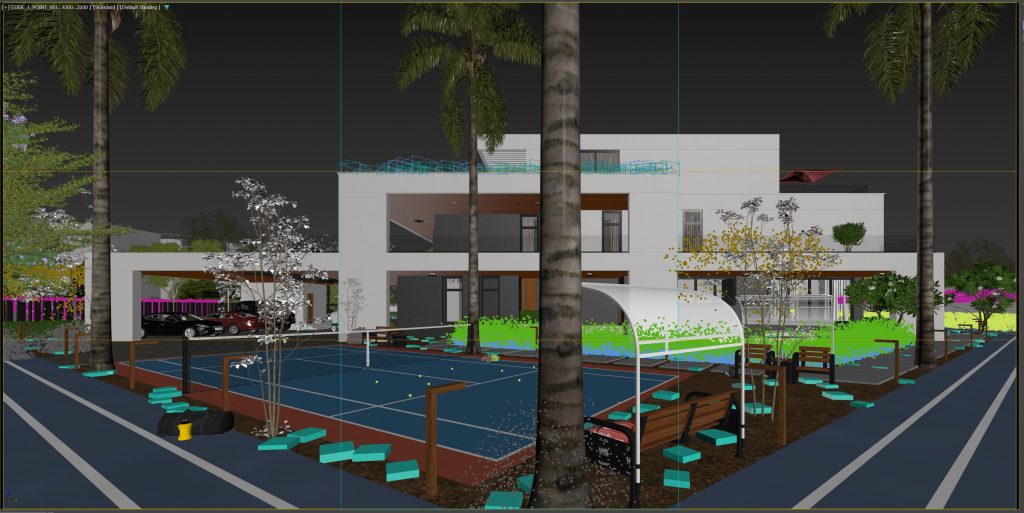
The palms in the scene were placed first to serve a compositional purpose before actual landscaping. I guess you could say landscaping itself is composition. The palms helped add some strong verticality to a heavily horizontal scene. They also helped create some boundary and vignetting ensuring that the viewer’s focus is kept on the subject (the building).
3. LIGHTING
The goal here was to showcase the architecture in 3 very common lighting scenarios Dusk, Overcast, and Sunny.I have achieved this mainly using HDRIs and some Corona lights for accents. I’ve always believed that to maximize the potential of any shot, you need to find what the most fitting light for that shot is. Some shots pack the greatest punch in sunny lighting, while others benefit more from the diffused light of overcast. If your project allows you the freedom, try to experiment with different light setups on every shot, you’ll be pleasantly surprised.
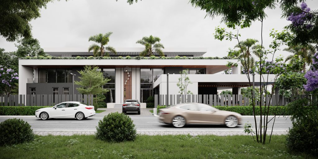
3a. OVERCAST
I used PG Sky 1106 hdri for this scene and took advantage of the diffused light to put materials and colors on full display. When I work with this sort of overcast light, I always like to make my greenery as rich and fresh as possible, it makes a world of difference. The light supplied by the hdri in this case is neutral so you’ve got to push your emphasis onto the colours and make them Pop.
Depth building is really important with any mood but needs to be paid extra attention when creating an overcast image. Because the light is diffused, you’ll need to cleverly create the sort of contrast that highlights your focal element. In this case, the trees as a vignette did the Job, but I had to put more objects behind them to block the light from reaching them, that way the areas with more light were closer to the building.
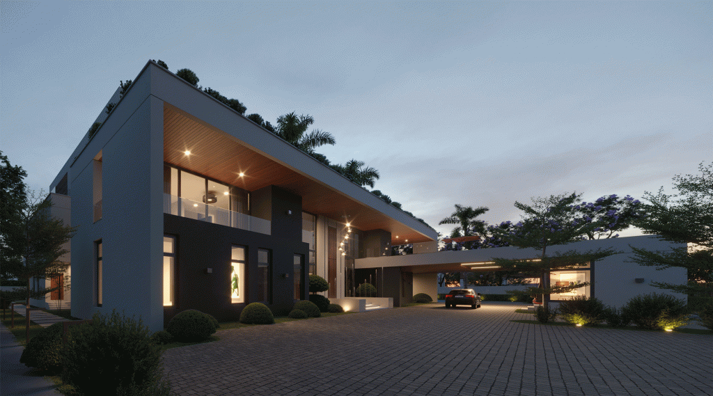
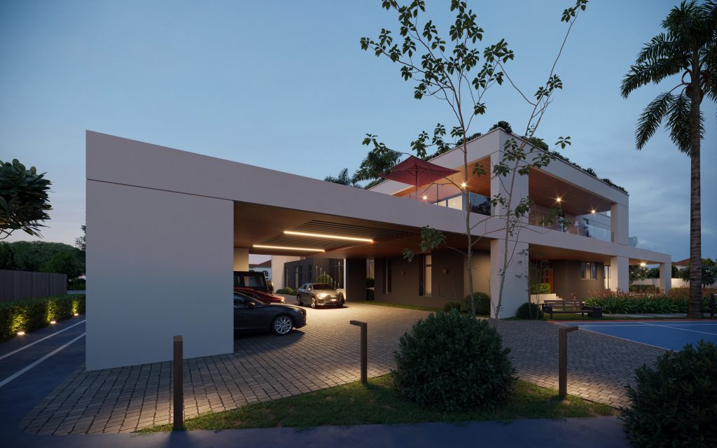
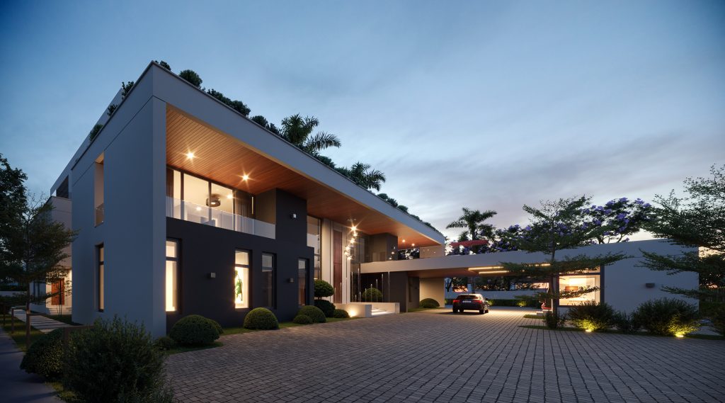
3b. DUSK
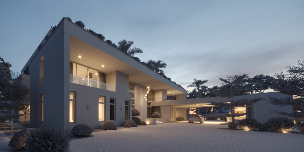
I used 3DCollective Pack 03 hdri 2008 for this. I like that it’s not a completely blue sky, towards the horizon it gets a bit pinkish and this adds an extra layer of nuance to the reflections. I decided to go with warm colors (mostly 3500k) for the artificial lights, this provides that complementary balance of colour in the image.
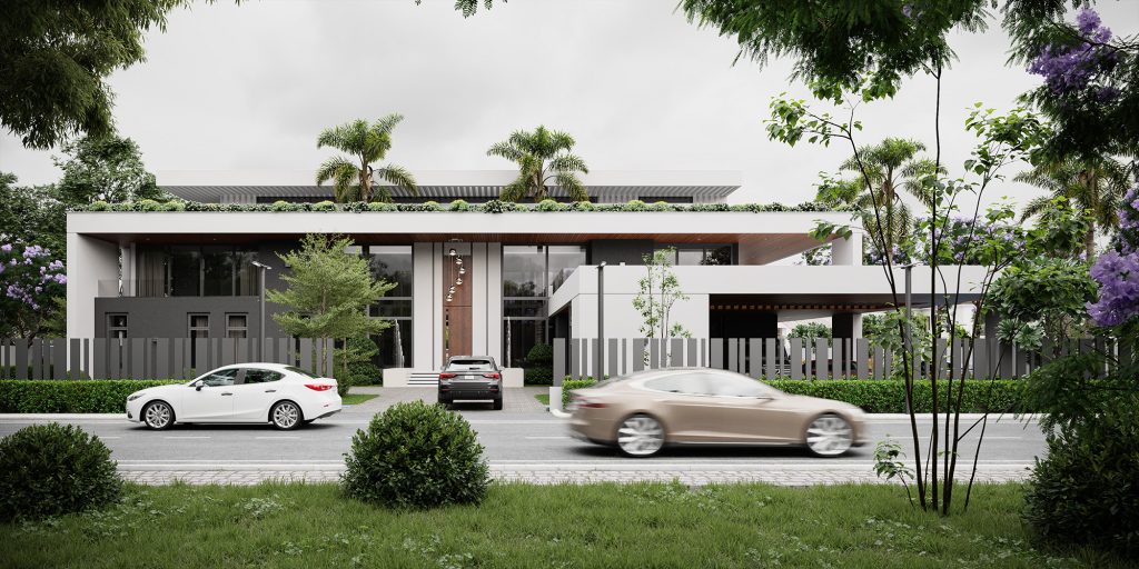
3c. SUNNY
Here, I used 3DCollective hdri 1751 it’s a really nice and punchy sky and it worked very well for this scene. When I’m working on sunny scenes, I’m thinking mainly Shadows. When I’m rotating the sun or sky in this case, it is to find the angle that gives me the best shadow composition for the scene I’m trying to create. In this shot the sun is positioned behind the camera, the resulting shadows help obscure the foreground and lead the viewer to the building.
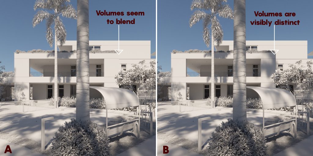
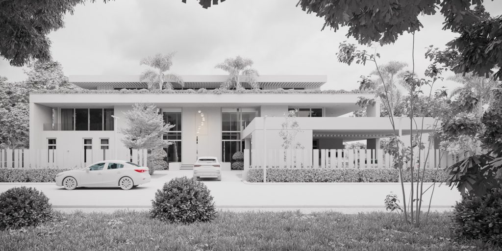
Another crucial use of shadows is Volume separation, Image A is what I initially had after I had completely composed my scene. Everything seemed good except that I could see that the complete story of the architecture wasn’t being told. I wasn’t seeing every volume with its true depth. Those two volumes are distinct and it had to be self-explanatory. All I needed to do was introduce a tree behind the camera specifically to cast shadows on that intersection. The tree was very akwardly placed, but it didn’t matter, in 3d space, you’re pretty much almighty, so do what you need to do to get what you need to get.
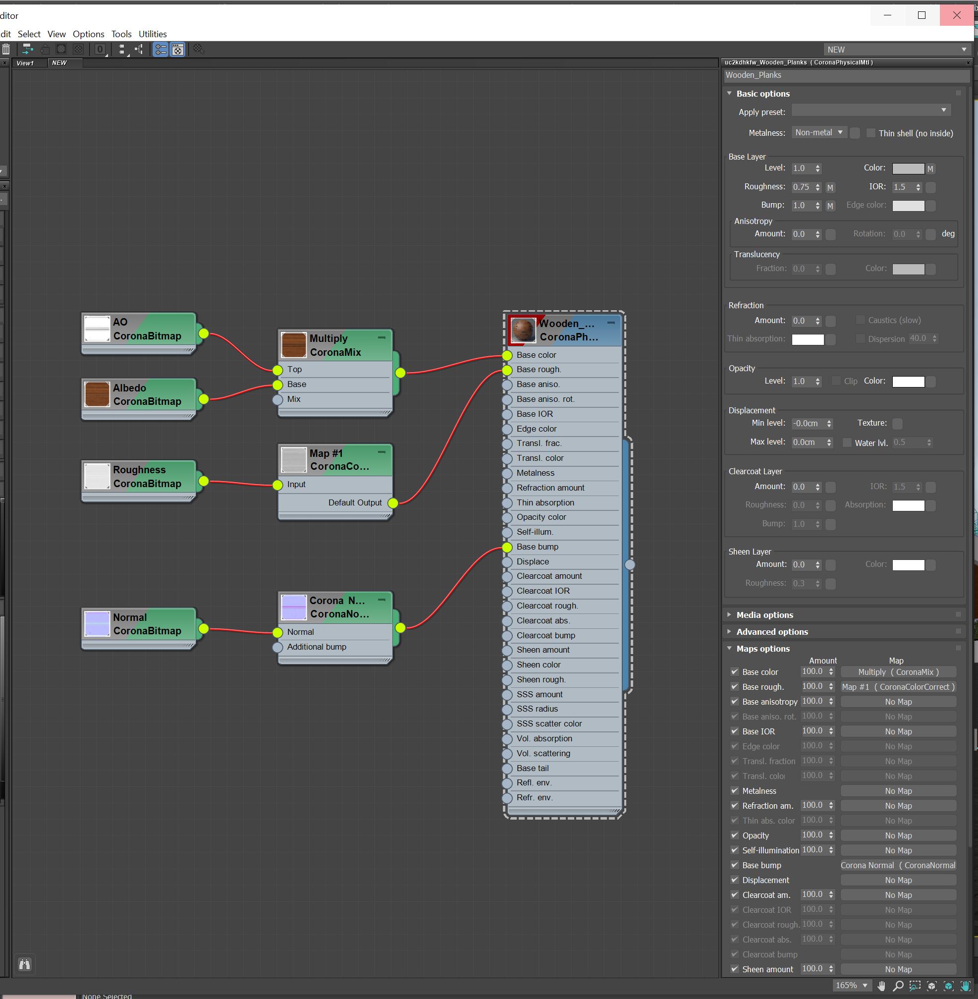
4. MATERIALS & 3D ASSETS
For the materials in this project, I have used textures from quixels megascans and Poliigon.com. I typically make adjustments as I see fit to these textures, some colour correction, masks, reflectivity, bump or displacement levels, nothing complicated usually.

3D assets are from 3dsky, evermotion, dimensiva, maxtree and megascans. The same thing applies to the 3d assets too, their materials have been adjusted where necessary.
5. POST-PRODUCTION
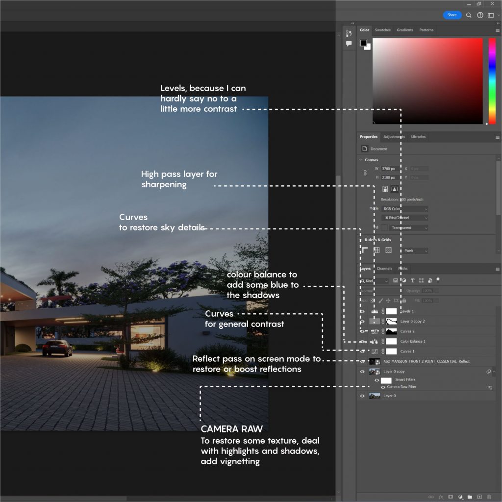
I built my basic look using the tone mapping options in Corona VFB. I corrected things like exposure and added suitable LUTs for each scene. The result was then taken into Photoshop to add a bit more contrast, tone, and restore some lost details, especially in the reflections and backplate. It typically would look something like this.
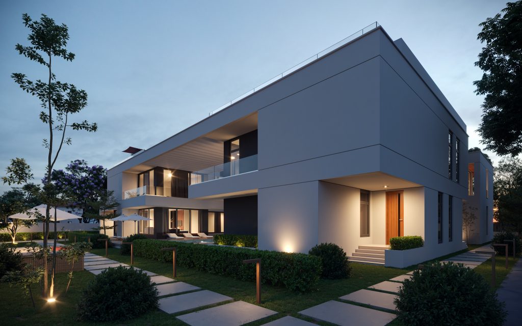
6. RENDERS FROM THE PROJECT

7.FINAL WORDS
My takeaway from this project and from most projects I work on, is to always ask if it can be more excellent. We don’t always get enough time on projects (especially commercial ones) to be fully expressive but I believe that every project presents the artist with an opportunity to do something, at least one thing, more excellently.