


BACKGROUND
Sometime in 2019, my wife looked at me and said, “You know I’m a big fan of your work, right?” I thought to myself, “Oh, it’s a bout to go down.” She continued, “But why don’t you introduce more vibrant color into your interiors? Not every space needs to have white walls and parquet floors.” (I happened to be in my “white walls and parquet floors” phase, apparently, and she was right. Adding some vibrant colors to walls and furniture would have been a breath of fresh air.) However, not entirely enjoying the constructive criticism, I had something more sinister planned. I thought, “Oh, so you hate white walls and parquet floors? How about I cover the entire scene in crimson, scarlet, bloody red paint? How about I create a crime scene!” (Proceeds to laugh in Evil).
Okay, those weren’t my exact words or mannerisms, but I did start with a bit of rebellion. However, once I began the project, I really got into it. This was new for me at the time, and coasting through all the new ideas, opportunities, and challenges of the project made the journey unforgettable. I’ll share a brief summary of the process below.
REFERENCES
I’d say I gathered references passively for this project. Like many artists, my timeline is rife with beautiful images from photographers, painters, and 3D artists, and I’m constantly archiving them. On Instagram, I found a rather interesting close-up photo of a bathtub, and that’s where the idea of making a bathroom came from. It had really interesting mosaic floor tiles, and I just had to do my own take. I also found an interesting 3D project on VWArtclub where the artist created a neoclassical living room with the walls painted completely black. I thought to myself, “My red space should have a neoclassical touch; it would complement the color well.”
I’m sure I must have subconsciously absorbed several other images that contributed to this work, but those two really stood out to me.
THE IMAGE
I had already decided on the space function and architectural style. The question that remained was, “What’s the story of the image?” The image story doesn’t have to be some fancy philosophical challenge; it’s simply what you want the viewer of the image to see and feel. I only had one viewpoint in mind at that time, and it was the viewer standing at the bathroom entrance, looking at the bath.
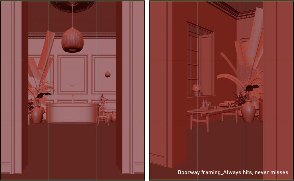
I wanted to create a sense of walking into the space toward the bath. Showing your subject through doorways or entrances always works well here. Why? Because people are curious; they’ve just got to experience what’s on the other side. I also wanted the space to feel calm and organized despite my odd choice of color: RED. I knew that with the right tone, lighting, and scene composition, I could achieve this calm feeling.
COMPOSITION AND LIGHTING
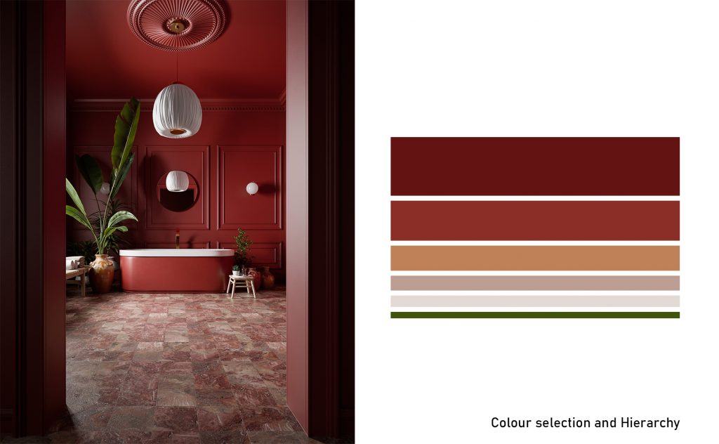
I made every composition and lighting decision solely to maximize color. The world we live in can only be represented visually through colors. Making colors exist within a boundary or shape helps us perceive objects, and altering the tone and shades of colors helps us perceive light and materiality. In other words, the job of an artist is to arrange colors in the most intentional way that conveys your message.
Armed with this information, I made material and object selections to complement the red base color. I knew I could create some contrast with the color white (Santa style), so I strategically positioned a few white elements across the image (bath lip, wall lights, chandelier, towel). The flooring also captured some of that white, along with some slight orange tones to reference the wooden elements and plant pots. This sort of “painter’s thinking” always harmonizes the entire image.
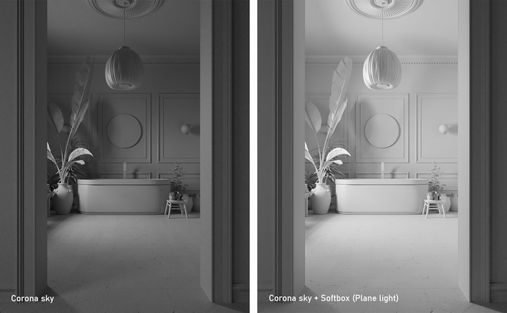
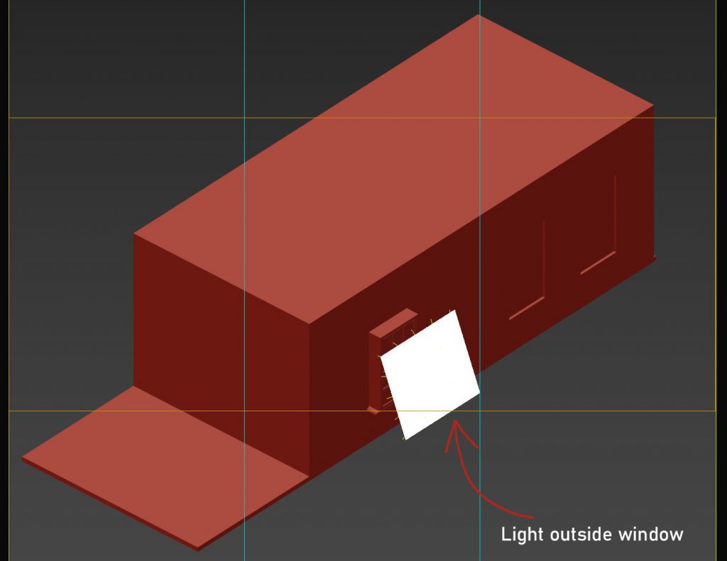
For the light, I knew I wanted something a bit diffused but fairly bright. I chose to go with an overcast HDRI; this generally lets you appreciate materiality. To supplement this overcast light, I positioned a small softbox (plane light) just outside the window. This improved brightness and also allowed me to get slightly more distinct shadows.
EXPERIENCING THE SPACE
My pursuit of a calm feeling in this space would be greatly impacted by how I chose my viewpoints. One situation can be interpreted in multiple ways; it depends a lot on perspective, and I wasn’t about to be unintentional. I knew that narrower focal lengths would reduce tension overall; the last thing I needed was tension. Also, taking closer views that focused on aspects of the space would create a more intimate experience for the viewer.
So, one image shows you walking into the bathroom, another places you near the bathtub, another near the cosmetics, and you can almost feel yourself using the soaps and scrubs. These strings of views and imagery gradually acquaint the viewer with the space and, in turn, personalize the experience.
FINAL WORDS
There’s a lot of beauty on the other side of inflexibility. Criticism, even when constructive, can sometimes feel grating or abrasive. We should learn to ignore that feeling and find the value in it.